![]()
![]()
![]()


Modules containing reusable functions for machine learning visualization plotting
- Python 3.13 or later
python3 -m pip install opengood.py-ml-plotNote: See Release version badge above for the latest version.
Set up a 2-D classification model plot then display its result visualization.
Notes:
- The example below uses a dataset to train a logistic regression model then display the plot for the training set
- For feature scaling, if required, implement the feature scaling logic in the
feature_scalinglambda - For predictions, implement the prediction logic in the
predictlambda
import os

import numpy as np
import pandas as pd
from matplotlib import pyplot as plt
from matplotlib.colors import ListedColormap
from sklearn.linear_model import LogisticRegression
from sklearn.model_selection import train_test_split
from sklearn.preprocessing import StandardScaler

from src.opengood.py_ml_plot import setup_classification_plot

resource_path = os.path.join(os.path.dirname(__file__), "../resources", "data.csv")
dataset = pd.read_csv(resource_path)

x = dataset.iloc[:, :-1].values
y = dataset.iloc[:, -1].values

x_train, _, y_train, _ = train_test_split(x, y, test_size=0.2, random_state=0)

sc = StandardScaler()
x_train = sc.fit_transform(x_train)

classifier = LogisticRegression(random_state=0)
classifier.fit(x_train, y_train)

setup_classification_plot(
    x=x_train,
    y=y_train,
    cmap=ListedColormap(("salmon", "dodgerblue")),
    title="Logistic Regression",
    x_label="Age",
    y_label="Estimated Salary",
    feature_scale=lambda x_set, y_set: (
        sc.inverse_transform(x_set), y_set
    ),
    predict=lambda x1, x2: (
        classifier.predict(
            sc.transform(
                np.array([x1.ravel(), x2.ravel()]).T)
        ).reshape(x1.shape)
    ),
)

plt.show()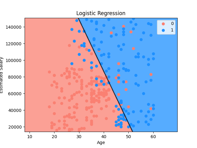
feature_scale lambda implementation logic for function
setup_classification_plot is as follows:
- Inverse feature scaling is invoked via a featuring scaling object, such as
the
StandardScalarobjectsccreated earlier for feature scaling x_setandy_setare assigned non-feature scaled values of the matrix of features and the dependent variablex_setvalues are inverted from their feature-scaled values inxy_setvalues are not inverted and taken directly fromy
predict lambda implementation logic for function setup_classification_plot
is as follows:
- Classifier object
classifiermethodpredictis invoked - Since the values of the reshaped 2D array are not feature scaled, the
values are feature scaled via the
transformmethod on thescobject- This method call is not required for models that do not require feature scaling
ravelfunction from the NumPy library is used to flatten a multidimensional array into a one-dimensional arrayx1andx2are flatten into a 1D array via theravelfunction- They are then combined via the
arrayfunction from the NumPy library into a 2D array - The result is then reshaped via the
reshapefunction to match the shape ofx1
Visualization implementation logic for function setup_classification_plot is
as follows:
ListedColormapclass from the Matplotlib library creates an object that generates a colormap visual from a list of colors- If the
feature_scalelambda is defined,x_setandy_setare assigned non-feature scaled values of the matrix of features and the dependent variable from the sets using a feature scaling object, such as theStandardScalarobject created earlier for feature scalingx_setvalues are inverted from their feature-scaled values inxy_setvalues are not inverted and taken directly fromy
- If the
feature_scalelambda is not defined,x_setandy_setare assigned the values ofxandy, respectively meshgridfunction from the NumPy library returns a tuple of coordinate matrices from coordinate vectors- Two sets of matrices (
x1andx2) are returned with coordinate vectors x1arangefunction is called with a defined start and stop intervalx_set[:, 0]returns all the rows for featurex1startparameter- Start of an interval
x_set[:, 0].min()returns the minimum value for featurex1- Value of
10is subtracted for padding
stopparameter- End of an interval
x_set[:, 0].max()returns the maximum value for featurex1- Value of
10is added for padding
stepparameter- Spacing between values
- Value of
0.25is added for spacing
x2arangefunction is called with a defined start and stop intervalx_set[:, 1]returns all the rows for featurex2startparameter- Start of an interval
x_set[:, 1].min()returns the minimum value for featurex2- Value of
1000is subtracted for padding - Value of
1000is used instead of10due to the difference in scaling for featurex2vs. featurex1
stopparameter- End of interval
x_set[:, 1].max()returns the maximum value for featurex2- Value of
1000is added for padding
stepparameter- Spacing between values
- Value of
0.25is added for spacing
- Two sets of matrices (
- The prediction logic implemented in the
preodictlambda is executed, and the result is assigned toy_pred, containing the predictions contourffunction from the Matplotlib library is used for creating filled contour plots- It visualizes 3D data in 2D by drawing filled contours representing constant z-values (heights) on an x-y plane
- These plots are useful for displaying data like temperature distributions, terrain elevations, or any scalar field where the magnitude varies over 2 dimensions
- The most basic use case of
contourfinvolves providing a 2D array representing the z-values - Matplotlib automatically determines the x and y coordinates based on the array's indices
XandYparameters- The coordinates of the values in
Z XandYmust both be 2D arrays with the same shape asZx1is used forXcontainingx1valuesx2is used forYcontainingx2values
- The coordinates of the values in
Zparameter- The height values over which the contour is drawn
ravelfunction from the NumPy library is used to flatten a multidimensional array into a one-dimensional arrayx1andx2are flatten into a 1D array via theravelfunction- They are then combined via the
arrayfunction from the NumPy library into a 2D array - The result is then reshaped via the
reshapefunction to match the shape ofx1
- Since the values of the reshaped 2D array are not feature scaled, the
values are feature scaled via the
transformmethod on thescobject
alphaparameter- The alpha blending value, between
0(transparent) and1(opaque) - Value of
0.75is used to make the blending mostly opaque
- The alpha blending value, between
cmapparameter- The
Colormapobject instance or registered colormap name used to map scalar data to colors salmonanddodgerblueare used for aListedColormapobjectsalmon= 0 or negative classifierdodgerblue= 1 or positive classifier
- The
xlimfunction from the Matplotlib library is used to get or set the x-axis limits of the current axesmin()andmax()forx1are used for the limits
ylimfunction from the Matplotlib library is used to get or set the y-axis limits of the current axesmin()andmax()forx2are used for the limits
- The values from
y_setare iterated over in a for-in loopuniquefunction from the NumPy library returns sorted, unique elements of an array- Values of
y_setare made unique and sorted
- Values of
- Iterator variable
irepresents the current row of iteration - Iterator variable
jrepresents the classification value for the dependent variable0negative classifier1positive classifier
scattermethod from the Matplotlib library creates a scatter plot of data points with the shaded contour showing the classification for the dependent variable- x-axis uses values from
x_setwherey_setvalue = 0 (negative classifier) - y-axis uses values from
x_setwherey_setvalue = 1 (positive classifier) cparameter- The marker colors
- Uses the
ListedColormapwith the classification colors for the current row at indexi
labelparameter- Sets the label
- Values
0negative classifier1positive classifier
- x-axis uses values from
Create Python virtual environment:
cd ~/workspace/opengood-aio/py-ml-plot/.venv
python3 -m venv ~/workspace/opengood-aio/py-ml-plot/.venv
source .venv/bin/activatepython3 -m pip install matplotlib
python3 -m pip install numpy
python3 -m pip install pandas
python3 -m pip install scikit-learnpip freeze > requirements.txtpython -m pytest tests/