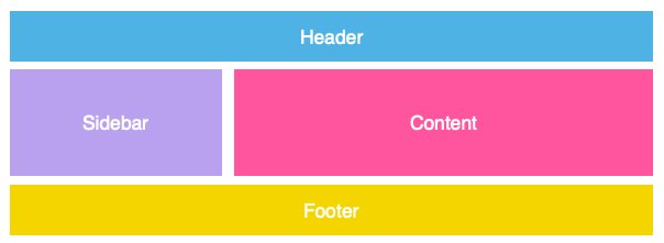
Chances are, I've either directed you here, or you've been spelunking through my GitHub repos: in which case, welcome! This tutorial assumes you have some fundamental knowledge of HTML/CSS, but if you don't, that's perfectly fine! You can see the layout in action here: https://ltephanysopez.github.io/grid-tutorial/
CSS Grid is a technique in CSS that allows developers to create responsive web design layouts more easily and consistently across browsers.
Let's create a container that holds a couple of items in our HTML.
<div class="grid">
  <div id="item-1">1</div>
  <div id="item-2">2</div>
  <div id="item-3">3</div>
  <div id="item-4">4</div>
  <div id="item-5">5</div>
  <div id="item-6">6</div>
  <div id="item-7">7</div>
  <div id="item-8">8</div>
  <div id="item-9">9</div>
</div>
To turn our container into a grid, we simply give it a display of grid:
.grid {
    display: grid;
}
Because we haven't defined any grid properties yet, our current grid will simply stack all items on top of each other.
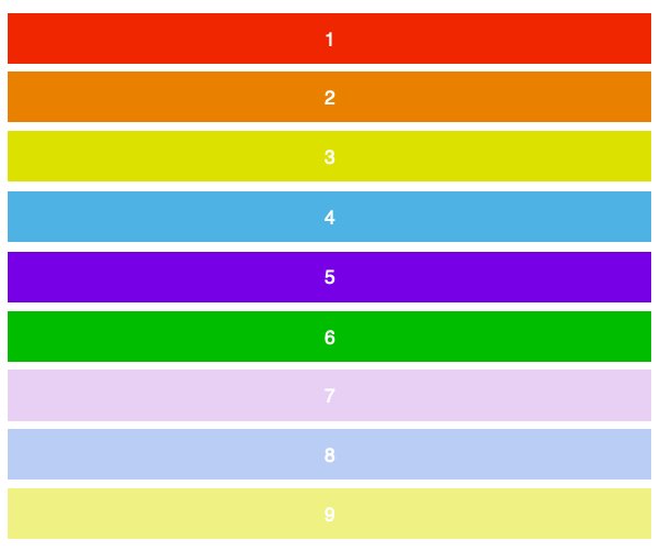
To make a two-dimensional layout, we’ll need to define the columns and rows. For this example, we'll create three columns and two rows by using the grid-template-row and grid-template-column properties.
.grid {
    display: grid;
    grid-template-columns: 100px 100px 100px;
    grid-template-rows: 50px 50px;
}
As we’ve written three values for grid-template-columns, we’ll get three columns. Similarly, we’ll get two rows as we’ve specified two values for the grid-template-rows. The values dictate how wide we want our columns to be (100px) and how tall we’d want our rows to be (50px). Here’s the result:
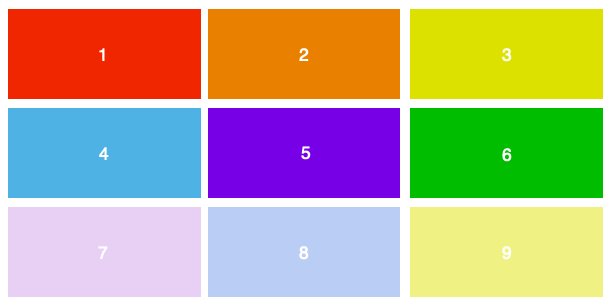
Using the same markup with different values, let’s create a 3x3 grid.
.grid {
    display: grid;
    grid-template-columns: 100px 100px 100px;
    grid-template-rows: 100px 100px 100px;
}
To position and resize the items we’ll target them by using the grid-column and grid-row properties, which define items by grid lines:
#item-1 {
    grid-column-start: 1;
    grid-column-end: 4;
}
The markup above says that the first item will span from column line 1, and end at column line 4. In other words, it’ll take up the entire row. Here’s how that’ll play out on the screen:
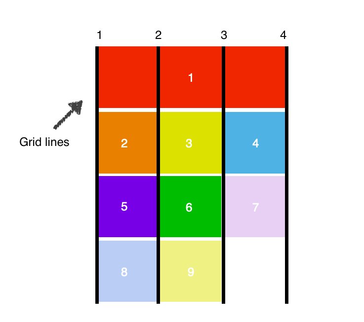
Since we're using the first item is taking up the entire first row, the rest of the items are pushed down.
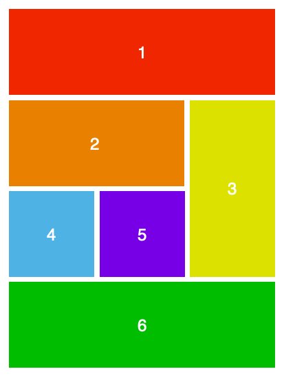
And that's the basics of CSS Grid! With the properties we've discussed so far, let’s rearrange the items a little bit.
#item-1 {
    grid-column-start: 1;
    grid-column-end: 4;
}
#item-2 {
    grid-column-start: 1;
    grid-column-end: 3;
}
#item-3 {
    grid-row-start: 2;
    grid-row-end: 4;
}
#item-6 {
    grid-column-start: 1;
    grid-column-end: 4;
}
Thanks for reading! I hope you found this tutorial useful. If you want to learn more about CSS Grid, check out these awesome resources:
- Grid Critters: https://www.gridcritters.com/
- W3Schools: https://www.w3schools.com/css/css_grid.asp
- CSS Tricks: https://css-tricks.com/snippets/css/complete-guide-grid/
- Grid by Example: https://gridbyexample.com/examples/
- Learn CSS Grid for free: https://scrimba.com/g/gR8PTE