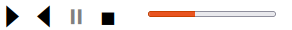
A webcomponent that displays playback controls (or media controls) for web animations.
Demo: https://cnoelle.github.io/playback-controls/
Demo with suspension: https://cnoelle.github.io/playback-controls/index2.html
Install: npm install playback-controls
Html:
<playback-controls></playback-controls>Javascript:
import { PlaybackControls } from "playback-controls";

PlaybackControls.register();
const ctrl = document.querySelector("playback-controls");
ctrl.setAnimationListener({move: (state) => {
    // TODO: show animation state at specified completion fraction
    console.log("Fraction completed:", state.fraction);
}});
A complete example can be found in https://github.com/cnoelle/playback-controls/blob/main/index.html.
Configuration is achieved partly via attributes and properties, and partly via CSS variables.
- Animation duration: specify the attribute
animation-durationor Javascript propertyanimationDuration, in ms. Default: 10000 (10 seconds). Example:<playback-controls animation-duration="5000"></playback-controls> - Remove titles: by default, the controls come with a title attribute, implying that a tooltip is displayed when the user hovers the controls. This can be removed by setting the
no-titlesattribute or by setting the propertynoTitlesto true. Example:<playback-controls no-titles></playback-controls>.
- playback-controls-color-active/playback-controls-color-inactive: adapt the color of the control icons. Default: black/gray. Example:
playback-controls { --playback-controls-color-active: darkblue; --playback-controls-color-inactive: lightblue; } - playback-controls-font-size: Control icon font size. Default:
2em. - playback-controls-progress-width: Progress indicator width. Default:
8em.
- Uses Unicode symbols for the control icons: https://en.wikipedia.org/wiki/Media_control_symbols#cite_note-5
- Modern Javacsript: written in Typescript as an ES module
- No external dependencies
Requires a recent version of NodeJS. Install dev dependencies: run
npm install
in the base folder of the repository.
Run
npm run build
The repository contains an index.html file in the base folder that shows a basic usage of the component. It imports the module from the dist folder, therefore it is required to build once before changes in the source code are applied. To run a dev server:
npx http-server
Then open http://localhost:8080 in the browser.