2. Basic configuration
QuickCapture Esri Labs is graduating into a fully supported ArcGIS product. ArcGIS QuickCapture is planned to be released on June 25, 2019 and its Esri Labs version will be retired a that time.
If you are new to ArcGIS QuickCapture and are looking for information into how to configure the app, we strongly recommend you start with the official ArcGIS QuickCapture app in our Esri Early Adopter Program at: https://earlyadopter.esri.com/key/ArcGISQuickCapture
If you are already using ArcGIS QuickCapture Esri Labs, you will also find detailed information in the Early Adopter Site about how to migrate your existing projects from ArcGIS QuickCapture Esri Labs to ArcGIS QuickCapture.
The appearance and behavior of QuickCapture buttons are determined by the configuration of a service's one or more feature templates. One feature template is equivalent to one QuickCapture button, and their order determines the order of buttons in the app. You can either create new feature templates (with defined symbology and default attributes) or modify existing ones. In order to create or modify a feature template (or to reorder them) you should use the Map Viewer application: (About feature templates and how to update them).
For more advanced configuration it is also possible to utilize specific QuickCapture parameters and variables. These can be used to control things like button grouping, mutual exclusivity and positional/senor values coming from the device.
Button colors and shape are inherited from the symbology defined in the feature template. In order to update a templates symbology, the template can be modified using the Map Viewer application and saved.
When re-styling buttons you need to be aware of the following:
- Styling for buttons comes from the symbol associated with the feature template. You may use standard symbols or upload custom images
- Button coloring is controlled by the colors for the symbol (e.g fill color, outline etc).
- There are two buttons styles -
-
Text only - This style is used when a simple marker(esriSMS) is selected as the symbol type.

- The fill color, outline width and outline color are used to style the button.
- The button's shape is based on the simple symbol's style (Point layers only)
- Circle (esriSMSCircle) - Rounded sided buttons

- Square (esriSMSSquare) - Square cornered buttons

- Any other - Slightly rounded corners

- Circle (esriSMSCircle) - Rounded sided buttons
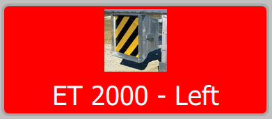
- Image and text - This style is used if a picture marker (esriPMS) is used for the symbol type (Point layers only). Picture markers symbols do not have have fill or outline properties. To colourize the button background or outline, use the button configuration properties listed below.
-
Text only - This style is used when a simple marker(esriSMS) is selected as the symbol type.