Replies: 18 comments 25 replies
-
|
Quick thoughts (@Pwessel)
|
Beta Was this translation helpful? Give feedback.
-
|
So I don't know if we have to follow those exactly but they were more to imagine the sorts of things that might be of interest. I suggest we start with the Choropleth of some Census bureau data since the data is usually easy to acquire relatively. I will find a suitable county dataset maybe income or age or something. I would like to start off with an explanation of the geo files that are needed, so for example the county shapefiles and the census info... Then describe for example what is in a shapefiles and how you can build a dataset that provides the measurements for each county, how GMT interprets that dataset, how to build a color palette, how to put it all together, what kinds of projections you can use etc etc For something like the first map with one dot per X people we might be able to get Census PUMS/PUMA data (public use microdata area), each area represents close to 100k people in the US, so if we could find the centroid of each area we could plot something like that map. |
Beta Was this translation helpful? Give feedback.
-
|
Ok, if you have true data is better. Won't have much time to look at this today but tomorrow afternoon should have some. |
Beta Was this translation helpful? Give feedback.
-
|
My quick attempt with random data worked better than I thought so I'll leave it for you to play with when you have true data
|
Beta Was this translation helpful? Give feedback.
-
|
Great, I will start with that. Can you tell me what kind of object is "countymap"? what sorts of things can we do with it in Julia? Explaining this will help those who don't understand much about mapping! (like me!) when we call make_zvals_vec it seems to be doing a kind of "join" between values in "vals" and something inside "countymap" is that correct? and the join is based on some aspect of countymap (in particular "NAME") having the same value as the corresponding value in "ids"? |
Beta Was this translation helpful? Give feedback.
-
|
Also, can we use a custom colormap created in Julia? Suppose for example I want something created in Colors.jl like: http://juliagraphics.github.io/Colors.jl/stable/colormapsandcolorscales/ or something premade from ColorSchemes.jl: https://juliagraphics.github.io/ColorSchemes.jl/stable/ |
Beta Was this translation helpful? Give feedback.
-
|
This is going to be interesting between what we think the users should know and what they actually do. Don't have time now to expand (will do in 3-4 hours or tomorrow). Quick answers See the manual https://www.generic-mapping-tools.org/GMT.jl/dev/types/ for the GMT.jl types, namely the See the online help of |
Beta Was this translation helpful? Give feedback.
-
|
Great, thanks. I really appreciate any time you can give I know it's quite limited! |
Beta Was this translation helpful? Give feedback.
-
|
Hmm, not sure where to start with this so let me sate the basics and go a bit beyond that. We use x,y[,z] to plot lines, points (or any other symbols) or polygons. All plotting packages can do that by providing the data in files or Mx2[3] arrays. GMT is no exception and accepts input from text files with data as x y [z] or other field separators (e.g. x,y[,z]) in what is generically known as the comma separated values (or CSV). However, the above is a pure Cartesian that suites many usage cases but carries no information about the metadata. Imagine, and that is a very common situation, that the x,y are points in a projection system, UTM for instances. We need then to specify the projection parameters so that the software knows how to plot the data and eventually deals with data in other projection systems. We need then to store that info in the metadata. Think also that data contains the polygons delineating US Counties and we want to keep a trace of their names, area, centroids, zip code, etc. The most traditional format that stores this kind of information is the ESRI shapefiles (but several database formats may also be used) and it stores it in what is known as the attributes table. Those attributes can be anything but I'll stop here I think it's the limits of my knowledge. When GMT reads one of these files via I'll stop here for now and let you come with more questions (we still have to talk about grid and image formats that are the base map data). |
Beta Was this translation helpful? Give feedback.
-
|
Sorry, didn't answer to the colormaps question. Don't know how difficult is to use the colormaps from Colors.jl, probably not much but never looked at it because we have many of them and overall a quite long list in GMT. See |
Beta Was this translation helpful? Give feedback.
-
|
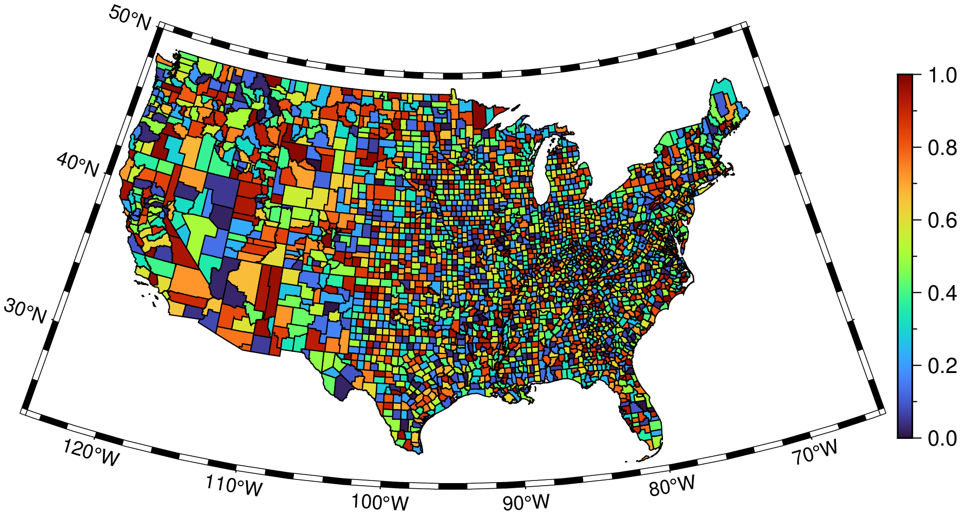
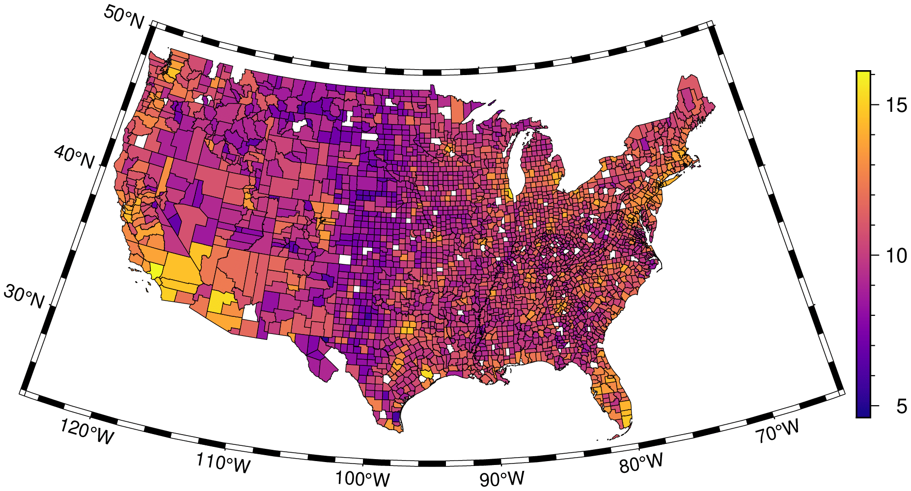
Ok, so here are some more real-world consideration. As you know, when working with real data things get messy! I'm using the dataset at https://www2.census.gov/programs-surveys/popest/datasets/2010-2020/counties/totals/co-est2020-alldata.csv which has county population estimates. In the US county names are not unique, but we have FIPS standards (federal information processing standards) which assign a unique code to each state and to each county in the state... so there are two fields we need to match on. I read in the counties shape file: and I see that counties[1].attrib is a dictionary and I can extract the STATEFP and COUNTYFP values to make a dataset: Now there are several non-matching lines towards the end of the dataset... with missing values...perhaps they correspond to some outlying territories like Guam or something I don't know. If I try to use them gmt doesn't like it: So I try eliminating the missingness: This results in a plot... but it's clearly wrong. For example Los Angeles County is in the lower left of this map, and should have 9M people or so, and yet it is colored dark blue meaning basically less than 1M and some random counties in the middle of the country are colored crazy high populations. |
Beta Was this translation helpful? Give feedback.
-
|
and yes I do realize I didn't do the make_zvals_vec method, but partly that's because I don't understand what it does, and partly because it feels like maybe the manipulation with the DataFrames join, which feels way way more natural, did something similar? |
Beta Was this translation helpful? Give feedback.
-
|
Ok @joa-quim I've pushed a new version with GMTMaps.jmd which includes the code I'm using to make the choropleth. You can see what I'm up to more explicitly. If you want to try to run it, just: |
Beta Was this translation helpful? Give feedback.
-
|
Tried it but I'm getting an error at this step (and other errors in consequence of it) Also, please remove the reference to the The reason is that I started to store the aspatial attributes as a comma separated string in EDIT: needs to be |
Beta Was this translation helpful? Give feedback.
-
|
So, the problem is the order of the values in the There is some issue when reading the shapefile that is loosing part of the name when it's a multi words name, but that's something to address latter. |
Beta Was this translation helpful? Give feedback.
-
|
Ok, so it's easy to reorder the dataframe, perhaps it loses order when I do the join. Let me check that out. |
Beta Was this translation helpful? Give feedback.
-
|
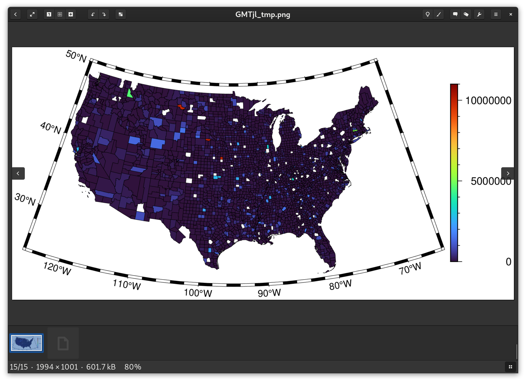
Great, so now I did this: And then when I plot I get a more reasonable map (this is using logarithm of the population so the colors aren't so starkly different) |
Beta Was this translation helpful? Give feedback.
-
|
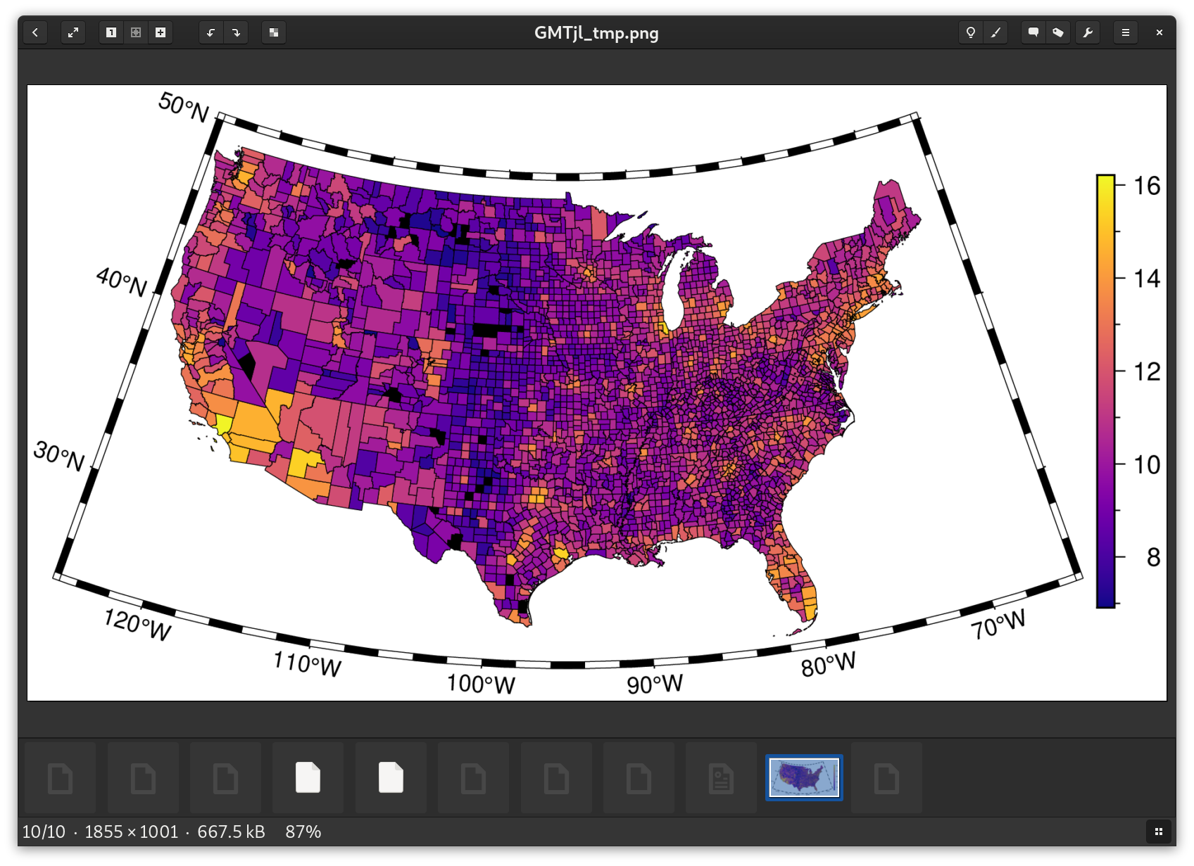
Without the logarithm transform... it's clear the LA county should be in charge of everything :-)
|
Beta Was this translation helpful? Give feedback.
-
|
Ok, so this is fantastic because it shows a clear workflow that will be understandable to data analysts and uses general tools such as DataFrames for achieving the necessary data munging. Thank you so much for help with this first example! I think an interesting next question perhaps is how to calculate population density (ie. take the population and divide by the area of the polygon). I assume GMT probably has a way to calculate the polygon area? |
Beta Was this translation helpful? Give feedback.
-
|
Areas (I knew this would come quickly) or use area is third value and it's the same as the other value. However, according to the GMT manual (sorry, no extnded GMT.jl manual for this) the default units should be square km, but it's not (Paul @Pwessel). To get them in km^2 or just to compute area of all polygons at once |
Beta Was this translation helpful? Give feedback.
-
|
Ok, I've done an example where it calculates density, which is a very interesting plot. but when I do gmtspatial(counties,area="k") I get back a length-1 vector of GMTdataset. So then I just immediately take the 1st element. What is the reason it gives back a vector of datasets rather than just a dataset? Is there some other situation where the vector makes sense? Also the dataset seems to have 3 columns as you say. It looks like the first two are lat/long values? what do they correspond to? Centroids of the polygons? |
Beta Was this translation helpful? Give feedback.
-
|
Yes, first two columns are the x/y (lon/lat in this case) coordinates of the centroid. |
Beta Was this translation helpful? Give feedback.
-
|
Also, suppose I want to save the image to a particular filename. Right now imshow is outputting to /tmp/GMTjl_tmp.png and overwriting the previous thing when I do a new plot. Suppose I want to plot to particular output files say for inclusion into a document or whatever? I imagine there is a keyword argument but I'm not seeing anything obvious in the docs to tell me which one, or perhaps I should be calling a different function to output to a file rather than show it in a window? Finally, is there a way to make the image show up in the output of the "weave" or in a Jupyter notebook etc? |
Beta Was this translation helpful? Give feedback.
-
|
Docs is an issue in GMT.jl, I know. A quite hard task as the GMT docs are big and one needs to adapt them but all plotting modules have this in the quick online docstrings
Still didn't try |
Beta Was this translation helpful? Give feedback.
-
|
Ah, same fig as mine with a modified version of the Don't mistake me, I like the DataFrames solution and I think it will be a more natural for people used to it but I'm too biased into the internal workings and prefer something more straight to the goal. Slightly different from yours because my colormap is:
|
Beta Was this translation helpful? Give feedback.
-
|
Maybe the simplest is to look at the code. The reason for this function is simply that I didn't know how to make what you showed me with DataFrames. And you are right that it intended to deal with the case of repeated polygons with the same identifiers (for examples a country with islands) but even that is not been taken care in latest versions of that function. I wonder if that is not the reason why you ended up with some BTW, do you know to identify variables with type |
Beta Was this translation helpful? Give feedback.
-
Although another way might be to use type dispatch so that the plot functions have multiple methods which handle the missing cases. However, I think it's maybe best to simply document that vals should be a vector which assigns a value to each polygon and let people construct such a vector on their own. Perhaps some utility functions are worthwhile, but the beauty of Julia is that we have available generic machinery to work together with our specialized machinery. DataFrames in particular give us lots of data manipulation techniques to use. Another option might be to allow to put a Dictionary which maps from identifier to value rather than a vector. The plot function could take this dictionary, and a function that takes a polygon and returns a key. This would be efficient when there are MANY polygons which all have the same identifier (for example if there is a particular "county" in Indonesia or something which consists of 30 small islands). Then inside the plotting function to construct the vector you iterate through the polygons, extract the key (which might be a tuple of values) and then lookup the key in the Dictionary to extract the numeric value, something like: |
Beta Was this translation helpful? Give feedback.
-
|
Thanks, the straight test The idea of letting the Also realized that the |
Beta Was this translation helpful? Give feedback.
-
Looks like no, seems like you'd have to do something more complicated. |
Beta Was this translation helpful? Give feedback.
-
Ok, I'm modifying my example, this is actually really easy, just |
Beta Was this translation helpful? Give feedback.
-
|
For including output into a weave / jmd document, i'm just using |
Beta Was this translation helpful? Give feedback.
-
|
Will have to confirm with weave but in jupyter and pluto one only have to do |
Beta Was this translation helpful? Give feedback.
-
|
when I just do plot as the last command in a code block it doesn't include the plot, so for now I'm using figname and explicitly including the file. I'm happy to look into what needs to happen to make that work, we should maybe ask on the Julia Discourse, or on the Weave repo discussion or something. |
Beta Was this translation helpful? Give feedback.
-
|
Want to finish some other stuff before and then will make a try with weaver. Probably we'll have to ask for some help. I had to do it for Pluto because it was not obvious at all what had to be done but maybe now it will be an adjustment of previous recipes. |
Beta Was this translation helpful? Give feedback.
-
|
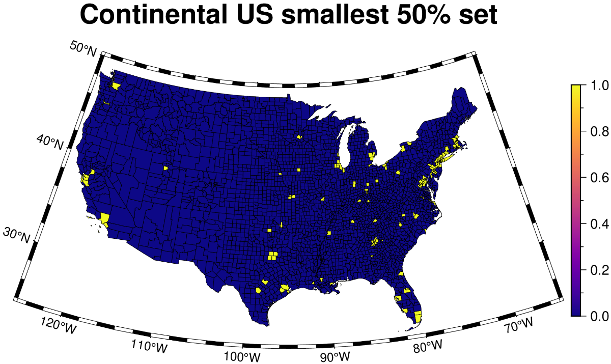
Ok, I have an interesting additional plot type. We can calculate the whole of the population estimate of the US... what is the smallest area that contains 50% of the population? We can plot this as 0,1 variables with a :plasma based cpt. So the question is how to calculate this set of counties... I'm thinking I calculate density, and then order by decreasing density, and then cumsum the populations, and include everything with cumsum less than 50% of total... Will give it a try! |
Beta Was this translation helpful? Give feedback.
-
|
Ok, solved... I pushed the code, and here's the 50% high density subset:
|
Beta Was this translation helpful? Give feedback.
-
|
I suspect a subtle bug, when counties consist of more than one polygon. I'll fix it later. |
Beta Was this translation helpful? Give feedback.
-
|
I believe I went through and fixed a number of problems in processing the data, including removing the "000" county (ie. the whole state), and calculating the area of counties that have more than one polygon correctly (by grouping data frames and adding up the areas for given county). The current version should produce valid maps I think. I think this shows choropleth maps pretty well so far. What do you think should be the second kind of map we look at? Maybe something that colors things continuously based on a field like temperature? |
Beta Was this translation helpful? Give feedback.
-
|
Hi, Regarding an example with temperatures I know where o get temperatures for oceans since they are easily measured by satellites but the same is no true for atmosphere. I think the most reasonable source for this is from meteorological models but I have no experience to get that type of data. Anyway, I think you are now aiming for an example that uses grid or image data that I mentioned in one of my first posts. You may want to have a look at RemoteS.jl Gallery in the docs for a some examples on using Satellite data. |
Beta Was this translation helpful? Give feedback.
-
|
Hi, some more changes. |
Beta Was this translation helpful? Give feedback.
-
|
Hi @joa-quim it's been a complicated couple weeks, I will look into some of these things next week after other stuff settles down. thanks for continuing to work on this project! Yes I think next we try some temperature or similar data. I'll see what I can find. |
Beta Was this translation helpful? Give feedback.
-
|
That's fine, no worries. Regarding the temperatures, as I told you sea surface temperatures are easy to find. Atmospheric I think we can't escape from model data. |
Beta Was this translation helpful? Give feedback.
Uh oh!
There was an error while loading. Please reload this page.
Uh oh!
There was an error while loading. Please reload this page.
-
I'd like to create an example Tutorial for using GMT.jl in Julia to do displays of social and scientific data, targeted at people who know something about working with datasets but generally are very naive about terminology, file formats, and specifics of mapping jargon etc.
Some examples of the kinds of things I'm imagining people in the target audience might want to create:
The audience would be people who understand how to use CSV, DataFrames, DataFramesMeta, merging, joining, data munging, regression, maybe simulations etc, but would like to display their data in the context of a spatial display, a map, or a 3D model or something along those lines.
Suggestions are welcome here for specific projects that can be tackled, either using specific datasets, or reproducing specific kinds of visualizations, or just general suggestions of "it'd be nice to see how to..."
@joa-quim welcome and thanks for your help!
Beta Was this translation helpful? Give feedback.
All reactions