Carousel Specification
- Revision History
- Objectives
- User Stories
- Acceptance criteria
- Functionality
- API
- Accessibility
- Internationalization
- Konstantin Dinev | Date:
- Radoslav Mirchev | Date:
- Simeon Simeonov | Date:
| Version | User | Date | Notes |
|---|---|---|---|
| 0.1 | Stanka Bozalieva | Oct 5, 2018 | Initial draft |
| 0.2 | Stefan Ivanov | Oct 9, 2019 | Update - in progress |
A carousel component is used to browse a collection of slides like galleries of images, cards, on-boarding tutorials or page-based interfaces. It can be used as a separate full – screen element or inside another component
igx-carousel can be used as standalone component in order to show a set of slides. It should be highly customizable, providing capabilities like slide transitions and animations, hide\show navigation buttons, dynamically load images, i18n and accessibility support.
As end user I would like to:
- Be able to navigate through a set of slides.
- Be able to navigate the slides via Next and Previous soft buttons.
- Be able to navigate the slides via the keyboard arrows.
- Be able to select and show a particular slide from the collection through pager/thumbs.
- Be able to interact with the slide so that it would open other relevant content.
- Have an indication about the current slide in the context of the collection.
As a developer I want to:
- Be able to provide the slides to be displayed using ngFor directive.
<igx-carousel [interval]="interval" [pause]="pause" [loop]="loop">
     <igx-slide *ngFor="let slide of slides;" [active]="slide.active">
         <img [src]="slide.image">
     </igx-slide>
</igx-carousel>- Be able to provide the slides to be displayed through pure markup
<igx-carousel [interval]="interval" [pause]="pause" [loop]="loop">
    <igx-slide [active]="slide.active">
        <img [src]="...">
    </igx-slide>
    <igx-slide>
        <img [src]="...">
    </igx-slide>
</igx-carousel>- I expect to have buttons for moving to the Next/Previous slide.
- I expect to have templatable indicators that support precise navigation, show the current status/active slide and progress. Such a template can be created for gots (Page indicators - iOS), a small thumb for every slide, or another custom layout.
- I want to create slide templates that can trigger an action that would take the user to a news article for example
- The indication area is to be replaced with informative text, e.g. “3 of 6”, when there would be more than 5 slides.
- I want to utilize touch gestures on the carousel such as:
- Flick left or right to change the active slide
- Pan left/right to peek to the next/previous slide without changing the active slide unless panning beyond a certain threshold and lifting your finger
- I want to show more than one slide at a time (similar to coverflow on MacOS)
- I want to be disable navigation of the carousel which would hide dots/thumbnail indicators and navigation buttons
- Height ( % ) vertical direction
- Width ( % ) horizontal direction
- I want to be able to make the carousel slides loop (false by default allowing the first slide can only go forward/ last slide can only go backwards)
- I want to configure the carousel to auto-play on every 3 seconds or another arbitrary amount of time (auto-play is disabled by default)
- On touch devices auto-play pauses when a long press is performed on the current slide
- On desktop devices auto-play pauses on mouse enter on the carousel and un-pauses on mouse leave after a 2 second timeout or another arbitrary amount of time
- I want to be able to set active slide shown by default when the page loads
- I want to set the active slide programmatically
- I expect to have default animations with slide transitions and be able to configure them
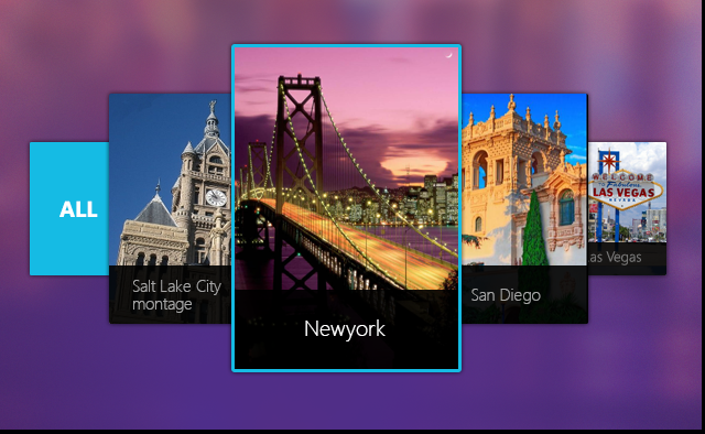
- Have carousel that shows image/set of images.
- Have carousel that should navigation button and image indicators.
- Have the ability to stop, pause or play the image transition.
- Have the ability to change current active slide.
igx-carousel should always display initial image and navigation buttons or image indicators.
igx-carousel should provide properties, events and methods what will manage carousel configuration and behaviors.
The end user interface consists of:
-
Navigation buttons
-
Slide indicators
-
Slides container
-
loop- Should the carousel wrap back to the first slide after it reaches the last. Defaults totrue. -
pause- Should the carousel stop playing on user interaction. Defaults totrue. -
interval- The amount of time in milliseconds between slides transition. -
navigation- Controls should the carousel render the left/right navigation buttons. Defaults totrue. -
total- The number of slides the carousel currently has. -
current- The index of the slide currently showing. -
isPlaying- Returns whether the carousel is paused/playing. -
isDestroyed- If the carousel is destroyed (ngOnDestroywas called).
-
onSlideChanged- Emitted on slide change. -
onSlideAdded- Emitted when a slide is being added to the carousel. -
onSlideRemoved- Emitted whe a slide is being removed from the carousel. -
onCarouselPaused- Emitted when the carousel is pausing. -
onCarouselPlaying- Emitted when the carousel starts/resumes playing.
-
play()- EmitsonCarouselPlayingevent and starts the transition between slides. -
stop()- EmitsonCarouselPausedevent and stops the transition between slides. -
prev()- Switches to the previous slide. EmitsonSlideChangedevent. -
next()- Switches to the next slide. EmitsonSlideChangedevent. -
add(slide: IgxSlide)- Adds a slide to the carousel. EmitsonSlideAddedevent. -
remove(slide: IgxSlide)- Removes an existing slide from the carousel. EmitsonSlideRemovedevent. -
get(index: Number)- Returns the slide with the given index or null. -
select(slide: IgxSlide, direction: Direction)- Selects the slide and the direction to transition to. EmitsonSlideChangedevent.
-
Roles: - role="button" https://www.w3.org/TR/wai-aria/roles#button
- role="list" https://www.w3.org/TR/wai-aria/roles#list
-
Attributes: - aria-label="carousel" https://www.w3.org/TR/wai-aria/states_and_properties#aria-label
- aria-label="setAriaLabel(slide)" - slide based
- aria-selected="slide.active" https://www.w3.org/TR/wai-aria/states_and_properties#aria-selected
The informative text for the indication area that reads e.g. "3 of 6" should have a localizable string for the "of" text.